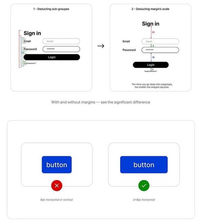
📊UX Pulse: Padding Isn’t Wasted Space—It’s A Best Practice
March 10, 2025
MYTH: Padding is unnecessary white space.\ FACT: Padding improves usability.
Some may think:
❌ "More padding = wasted space"
❌ "Users don’t notice padding"
❌ "It’s just a visual thing"
All wrong. Users feel bad padding before they even notice it.
Ever scrolled through a site that felt overwhelming?
Tapped a tiny button and missed?
Struggled to read text packed too tightly?
That’s bad padding.
But good padding:
✅ Improves readability
✅ Guides the user’s eye
✅ Creates a sense of order
It’s not decoration — it’s structure.
When a design feels right, users trust it.
Good padding = Good UX.
by Olena AgeyevaOlena A
Engineering Leader | Driving Innovation & EfficiencyEngineering Lead

